When we first walked this house, we were floored by the epic wainscotting but horrified by the choice of light fixtures in pretty much every room in the house. So light fixtures have been a huge focus for us since moving in and getting started on putting our stamp on the space. We’re pretty close on finishing up the front hall, or at least as close as it’s going to get for a while. Like the rest of the house, we’re painting the walls in here later this month, though I have dreams of hanging wallpaper (this one specifically) eventually and laying a Stark Antelope runner down the stairs. Those will happen later but are dependent on some other work happening first (namely refinishing all the floors in the house).
Moving on, here’s what the front hallway looked like just after moving in. I found that vintage rug on Cragislist for a mere $40 and trekked out to Dumbo for it – and am so happy I did. This hallway was desperately in need of a few things: (1) a stylish light fixture (2) that is centered on the door (3) pretty new door hardware and (4) a pop of colour on that front door.

So, we did all of those things. A few weeks ago we set aside a warm weekend to paint our front door Farrow and Ball’s Stiffkey Blue in high gloss, and we’re in love. Before we moved in, we ordered new front door hardware from Baldwin in unlacquered brass (SO hard to find and SO much more expensive than you’d ever imagine as a renter). Also before we moved in, Cory and I made our first trip to Brimfield during our mini-moon and found a very cool never been used vintage mid-century modern brass light fixture. It’s definitely different and we love it. There was a kerfuffle with centering the light fixture, where when we removed the old one and opened up the junction box, we realized there’s a joist running directly down the middle of the hallway, oof. Long story short: my husband told me we couldn’t center the light fixture, I said “but if we could… how would we do it” and 4 trips to Home Depot later and 1 ceiling medallion later, we had a centered light fixture. Yes.
And the after photos:
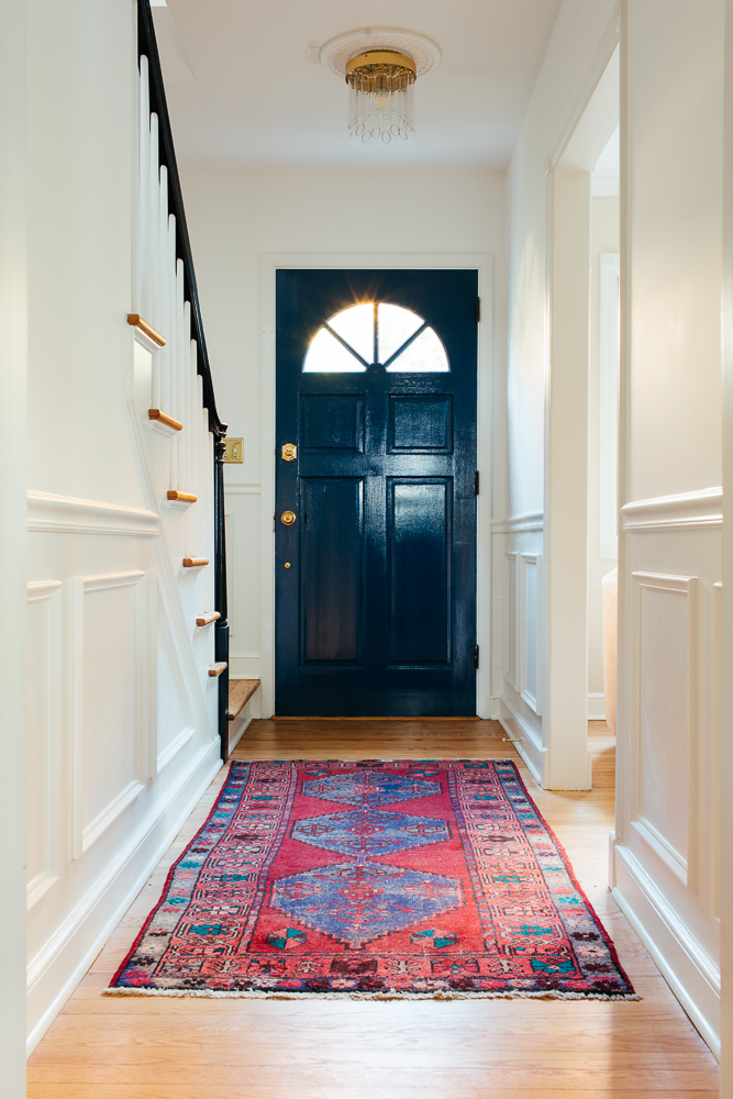
And a close up on the light fixture, which my sister has told me looks like test tubes and is weird but probably stylish? Eh, we love it, so it’s not going anywhere.


And that’s it for now. We still need to paint the ceiling in here, you can see some spackle that needs to be painted, but otherwise it’s a huge improvement. For consistency, we used the same ceiling medallion as in the kitchen.
Source:
Paint Colour | Front Door Hardware | Ceiling Medallion | LED Edison Bulb | Light fixture and rug are vintage