Master Suite: Updated Plans

Thank you all so much for your feedback on our master suite layout. Over the past week, we made some tweaks to the plan, but feel really good about the direction:

2017-12-20.png

  1. We reduced the width of the bathroom from 5”6 to 5”, which is a standard width for a long and narrow bathroom like this one. Since the space is laid out with all the fixtures on one wall, the 3 feet of egress will definitely still work and not feel too cramped. That large window also helps to keep the room feeling bright and spacious.
  2. We moved the door from the closet to allow for a double vanity. This part of the plan is very dependent on how the joists run in the bathroom once we’ve pulled up the subfloor and is liable to change.
  3. We stole the 6” in width from the bathroom for the closet to allow for hanging on both sides. Since we’re using our original hardwoods, we’re going to have to feather some of the boards we’re pulling up in the original closet to make up the 6” of floor currently tiled in the bathroom.
  4. The dressing area became a bit larger  and we have updated the closed storage for everyday essentials and hampers to be deeper for greater storage capacity.
  5. In the bedroom, I reoriented the bed to be on the right wall so we can center it under the window. In order to do so, we’re going to have to cap the radiator there and move it over to the top wall so that we don’t end up trapping all the heat under the bed.
  6. I’m also strongly considering adding a mantle to the bedroom on the wall you enter on to bring some more character to the space. Crossing my fingers I can find a vintage marble one on Craigslist in the coming months.

We feel really good about this plan and are super excited to start demo next week.

And, some inspiration for the direction of the master suite: traditional architectural details meets fun, modern elements with punches of colour.

We’re loving this wallpaper on the ceiling and the blue walls, which we’re going to be doing both in the walk in closet.

Another pop of blue with a built in bench, also inspiration for the closet.

I desperately want to add a (non-functioning) fireplace mantel to the bedroom and replicate that herringbone marble in both the mantel and shower.

Introducing: The Master Suite

One of the huge selling points for us on this house was that it had a master suite (not one other house we viewed had a proper ensuite and walk in closet), but we knew from the get-go that there’s huge potential to make the master suite fabulous. In the existing layout, there’s a ton of dead space, which makes for an unnecessarily enormous bedroom space and a cramped bathroom and walk-in-closet. As part of our plans for the remodel of this space is a complete redistribution of the space to allow for a sizable bathroom, much larger walk-in-closet and more efficient bedroom area. If you want to see photos of our current bedroom, it’s over here.

Below is the current layout:

snapshot-Sat, 09 Dec 2017 19-25-32 GMT.png

As you can see, the master suite is large (by northeast standards). The footprint is actually the combined space of the living room and dining room directly beneath it, for some perspective.

Some of the challenges we ran into in rethinking the layout are:

  1. Fixed window placement on the front of the house. That large window in the bathroom can’t be changed, since it matches the others on the facade. All of our plans to split the bathroom and closet on this side of the room ran into the challenging width of the window.
  2. Radiator placement. We didn’t want to lose the heat sources in the bedroom. We do still need to investigate having the plumbers run another radiator into the bathroom, since there isn’t a heat source in there and it gets cold in the winter! Our planned in-floor heating may be sufficient here though. It’s not in the rendering, but the radiators are beneath the window in that right side of the bedroom and under the left window on the top of the rendering.
  3. Current duct work that routes AC to the sunroom and living room presently goes through two corners in the existing closet.
  4. Key dimensions for the closet: while our walk in closet is large right now, it’s awkward, tight and it feels silly that we only have hanging space on one side and no space for anything else. But to gain hanging space on both sides, we’d need at least 6’ in width, which we can’t find in the room.
  5. The existing plumbing lines. Yes, moving the bathroom and closet to the opposite side of the master suite would absolutely allow us to have side by side closet and bathroom BUT the plumbing stack cannot be relocated 18’ across the space without a very high price tag, ripping up the floors and whole host of headaches. So that’s a no-go.

As of last week, this is the plan we had in place:

snapshot-Sat, 09 Dec 2017 19-23-52 GMT.png

Some things we liked about this plan:

  1. The bathroom feels a lot less cramped with the addition of space stolen from the old closet.
  2. The bedroom layout feels clean and simple
  3. The closet has a huge amount of hanging space (the left wall) and drawer and shelf space (on the right side.
  4. In the closet, we’d create a window seat that would hide the radiator and create a moment in the closet.

Some things we dislike about this plan:

  1. We don’t love splitting the bathroom from the closet, since Cory wakes up much earlier than me and would need to walk across the room twice to get out of the house in the morning without waking me up.
  2. The walkway in the closet is tight at 2′ wide. It would feel very narrow in here.
  3. We want to create a little dressing space in the closet with a hook for clothes, a large mirror and a spot to put on shoes.
  4. We lose the double exposures in the bedroom by losing the right window to the closet.

And then, on a whim, I remeasured the current distance from the bathroom to the end of the closet and realized we could get more width out of the closet if we moved it to the other side of the room.

snapshot-Sat, 09 Dec 2017 19-13-45 GMT.png

What we like about this plan:

  1. The bathroom and closet are right next to one another, so getting dressed is much simpler.
  2. We gain an extra few inches of walkway space in the closet that will help it feel less claustrophobic.
  3. We still get double exposures in the bedroom with light coming in from the East and South sides.
  4. We get a nicely sized dressing area in the top of the closet in the above floorplan, where we’d add a built in window bench under the window to enclose the radiator. Plus a full length mirror and built in storage for hampers and daily essentials.

What we don’t love about this plan:

  1. We’re a bit up in the air on our feelings about splitting up the double sinks (I have some good inspiration shots below).
  2. Is it strange to walk through the closet? If so, do we need to turn this into a hallway and put doors on both sides of the walk in closet?
  3. We’re losing some hanging space, but we still think we can make it more efficient than what we have now.
  4. The bedroom is laying out a bit strange with the window offset on the wall. I can solve this with a wall of curtains behind the bed or we can move the bed to the right wall, but need to figure out a plan for putting a bed in front of the radiator – any ideas here?

So that’s where we landed! Let me know if you have any thoughts on alternate floorplan ideas – it’s very much appreciated. We’re still not 100% committed.

And some great bathrooms with double vanities:

Jean Stoffer Design

And walk through closets:

Susan Greeleaf in Lonny

Astleford Interiors

Looking at these, I’m thinking maybe we add a pocket door to the bigger hanging section and leave the right side open to showcase some very pretty built-ins, the mirror and the window seat.

One other note, we debated long and hard how to fit a freestanding tub in the bathroom in addition to the shower and just couldn’t make it work without sacrificing the vanity size (SO important) or shower (also important). What are your thoughts on forgoing the tub?


One Room Challenge: Guest Bathroom, The Reveal!

For those of you who are new here – I’ve been documenting the process of remodeling our 1940’s Colonial home in coastal Connecticut into a space that’s modern, fresh and layered but still maintains its traditional roots. You can check out past week updates here: week oneweek twoweek threeweek fourweek five and week six.

Welcome to the final week of the One Room Challenge™, where we’ve spent the past six weeks completely renovating our guest bathroom from 80’s basic to a modern take on the old-school European hotel bath. This bathroom pairs with our guest room, so keeping a consistent thread from room to room was critical. To be completely honest, I wasn’t sure we’d complete this project in time because we bit off A LOT with this one (thank goodness for that extra week!).

During the course of this challenge, my husband and I took our bathroom down to the studs, laid new level subfloor, installed radiant in-floor heating, framed out the new tub, ran all new electrical and lighting, hung our first ceiling, installed cement board walls, installed our first tiled floor, completely tiled all four walls in the room, painted the ceiling and trimwork, grouted everything, hung crown moulding, installed all new lighting, installed the shower curtain track, and more. It was insanely busy and a very ambitious project for the two of us to tackle (plumbers handled all the pipes, rough in and fixture installation).

So, without further ado, let’s get on to the photos:

UM5A3702-2.jpg

UM5A3697-Edit.jpg

And a quick reminder of how far this bathroom has come:

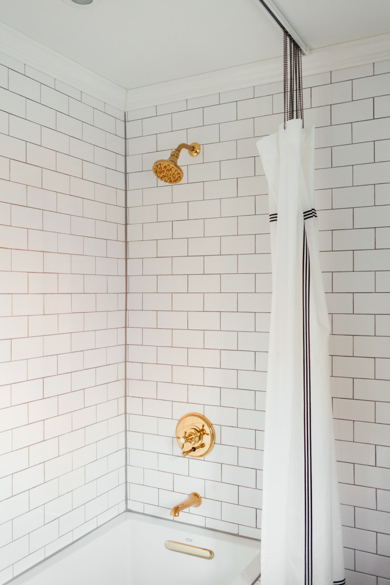
The tile is the star of the room. I knew that I wanted to use classic materials for the tiles, since they’re permanent fixtures that we never intend to change (and hope that buyers feel the same way if we ever choose to sell the house too). Starting with the floors, after a lot of debate, we opted for marble since it’s a nice upgrade and truly makes me happy. We also installed radiant coils, so these floors are nice and toasty (another upgrade). For the walls, I’m a huge fan of going big, so we used the basic subway tile that’s historically relevant to our home and applied to over all the walls. It was no doubt a lot more work but it completely elevates the space.

UM5A3688.jpg

UM5A3694.jpg

The tub that previously was in this bathroom was extremely shallow and was really non-functional for baths. After spending a lot of time at the Kohler showroom, we narrowed our choice to the Underscore soaking tub, since it’s great for baths but also comfortable to step into for showers and looks awesome. Since we took down the wall that closed in this shower, I was adamant about using a tub that didn’t require us to put walls back up to keep the space feeling nice and open.

The faucets were finds at the Restoration Hardware outlet that perfectly merge the clean, modern lines I love, with the vintage details like knobs labeled ‘Hot’ and ‘Cold’ that elevate the space and create a more custom feel. The brass hardware helps to bring some warmth into the room, which contrasts nicely with the all white subway tile.

UM5A3707.jpg

UM5A3762.jpg

UM5A3712.jpg

UM5A3733.jpg

The vanity was a last-minute decision when our first choice became out of stock and also allowed us to be opportunistic when we discovered we’d gained an extra few square feet of floor space. We swapped out the hardware for nice, heavy brass hardware from Rejuvenation that make this vanity look much more expensive and custom. I wasn’t sure how the stock marble countertop would look, since it can be hit or miss with pre-cut marble, but this countertop is actually a pretty gorgeous piece of stone with great movement and veining.

UM5A3828.jpg

UM5A3818.jpg

UM5A3811.jpg

UM5A3742.jpg

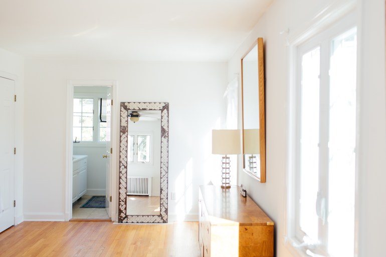
I’m a huge fan of having a lot of light sources in every room, and I make sure that as many of them as possible are on dimmers for instant ambiance. In here we added some extra lights including the pair of pendants flanking the mirror, the recessed light in the shower and relocated the overhead light so it was centered on the doorway. The pendants were super budget-friendly scores we found at Homesense but were in a shiny chrome. A few coats of matte black spray paint later and they totally fit in. The overhead light was a last minute swap (literally at 11P last night), where this CB2 light replaced a vintage find that we had sprayed black, but featured four more globes, which competed for your attention with the pendants. Using a simpler, lower key flushmount allows your focus to land on the pendants.

UM5A3792.jpg

UM5A3696.jpg

UM5A3809.jpg

We added the crown moulding to keep the room cohesive with the rest of our house. It’s a nice traditional element that keeps this room from floating too far into the modern end of the spectrum. We gave all the trimwork a fresh coat of paint, including the windows and door, which went Onyx by Benjamin Moore for an instant dose of chic. We spray painted all the window hardware a matte black to blend in. I’ve been debating this paint treatment on the windows for a while now, and seeing it in this bathroom has cemented that I need to do it on our main floor too. The ceiling and trim are painted in Benjamin Moore Decorators White, as in the other spaces we’ve completed in this house.

UM5A3784.jpg

UM5A3690.jpg

The shower curtain track was a DIY inspired by Kristin Jackson at The Hunted Interior, where we didn’t want to rush ourselves into a glassed in tub (which I don’t love for baths and is pretty pricy), until we’d tried out this budget-friendly solution. Apologies that the shower curtain looks a bit droopy – we ran out of ball chain and of course weren’t able to secure more in time. The rug is a vintage find from eBay, as is the lion’s head towel ring (which also matches the one in our main floor bathroom).

UM5A3747.jpg

UM5A3693.jpg

UM5A3713.jpg

UM5A3770.jpg

All in all we definitely pushed ourselves to create a bathroom that we’re completely smitten with and made sure not to sacrifice the design or any details for the sake of completing this room on time. Taking a step back and looking at how this bathroom works hand in hand with the guest bedroom it accompanies, I couldn’t be happier with the shared elements (crown moulding, ceiling medallion paired with black light fixtures, brass accents and vintage details), but they also both definitely have their own personalities and identities, mainly represented in the use of all-over immersive walls in totally different materials and colours. In short, we’re smitten.

Sources:

Marble Hex Tile | Subway Tile | Grout | Bathtub | Vanity | Vanity Pulls | Mirror | Toilet | Faucet | Shower Head | Tub Spout and Control | Shower Curtain Track | Hand Towel | Flushmount Light | Ceiling Medallion

And don’t forget to check out all the other awesome reveals by other One Room Challenge participants here.

downloadORC

One Room Challenge: Guest Bathroom, Week Six

Week Six of the One Room Challenge™ has been all about tiling the walls. (You can check out past week updates here: week one, week two, week three, week four, week five). Because I’m an overachiever, or maybe just really confident in our skills to figure out how to accomplish the look I’m going for, I ambitiously opted to tile our entire bathroom. That includes the tub surround and all four walls. And did I mention we’d never tiled before?

Excuse the mess in all these photos – this isn’t glamorous work.

UM5A3340.jpg

UM5A3355.jpg

UM5A3341.jpg

UM5A3343.jpgUM5A3342.jpg

UM5A3352.jpg

The all-over tile really helps to elevate the subway tile. And, I’m very particular about my tile transitions and wasn’t entirely certain of a way to end the tile around our tub, given it’s location in the room in a way that felt elegant.

We have been tiling non-stop since Friday night and since taking these photos knocked out most of the final wall.  Serious props to my husband, Cory, who kept us going on tiling, despite me nearly throwing in the towel more than a few times.

In the original room, the window trim butted right up against the wall, which would make tiling around it really awkward. We ended up sourcing new trim that was 2 1/4” wide instead of 2 1/2” wide that allows for just enough space to slide the tiles behind the window trim for a much cleaner and more intentional look. They don’t, however, make rosettes that are 2 1/4” square, so we ended up using the table saw to slice 1/8” off each side of the rosettes to line everything up nicely. This whole issue gave me some anxiety, but I’m so happy with how we managed to make it work.

For the tile, these are some of the things we’ve learned:

  • Subway tile comes with built in spacers (called lugged tiles), but I really wanted the grout lines to be more visible, so we used 1/16th inch spacers on the built in spacers, achieving essentially a 1/8th inch grout line.
  • Start with a super level first row, otherwise you’re going to be fighting to keep your lines straight up the wall. We nailed straight ledges into the wall using whatever we had around (leftover drywall edges, old door trim, etc.) to support our first row. We also started with our second row and are going back to add the real first row after all the tile work is done.
  • We have an old house and our walls aren’t perfectly straight and that’s a bit visible in the corners. Given that, to start each new row of tile, we marked the center of a new tile with a China pencil and placed that dead even between two tiles below it and then worked out from the middle of the wall to the edges. This means our edge tiles aren’t all consistently sized from row to row, but our grout lines are running straight.
  • Don’t assume that if you use your spacers that all your corner tiles are going to match up. We did and were surprised when we got to the shower head wall and started tiling from the bottom up, staying in line with the tiles on the front of the tub when the row above the apron of the tub just didn’t line up with the tiles running across the tub. Hard to explain, but constantly be measuring that all your corners and edges are indeed lining up.
  • If you don’t want to chip your tiles on the tile saw, make an initial 1” cut on one side of the tile, then flip it over and make the full cut through the tile. We learned this fast when we were chipping tiles left and right.
  • We used both thinset and tile adhesive in this room. Make sure you’re using the right adhesive for the right surface. Thinset is messy and since we were mixing it ourselves (instead of buying premixed) you had some wait time to let it set, etc. On the drywall we used tile adhesive, which comes premixed and goes a long way. We found the tile adhesive to be a lot easier and tidier to work with. Just make sure you wipe down the tiles fast, because it’s hard to remove the adhesive off the tile edges and face.

All in all, while this was an insanely huge task, I’m so happy we stayed on the path to tile all the walls. Given how inexpensive subway tile is, the cost to do all the walls is still very low (I think we spent ~$350 on subway tile) but the impact is huge. I know it’s a tile that’s everywhere, but given it’s historical roots, I do believe it will stand the test of time. Especially applied in a way that is so immersive and detail oriented, it really takes the room to the next level.

What’s really going to finish off these walls is the grout (we’re going with a medium grey) and crown moulding. I know crown moulding is an unusual choice in the bathroom, but I believe it’s going to pull together all the rooms we’ve completed in the house as a cohesive story. Plus it really blends the traditional with the modern in this room.

In addition to tiling, we also painted the door, replaced the door trim, replaced the window trim and painted the crown moulding.

Lest we forget that we have to reveal this room NEXT WEEK. Which means we have a ton to accomplish before then:

  • Build the niches (which requires a last minute trip to Floor & Decor in NJ, ugh.)
  • Run the final row of tile along the bottom edge (we’re about halfway done)
  • Grout all the walls
  • Caulk all the edges
  • Install the crown moulding
  • Seal the grout
  • Install the light fixtures and fan
  • Hang the mirror
  • Install the shower curtain track
  • Install the vanity and hardware
  • Plumbers are coming Monday to install all the fixtures
  • Style the space

Well, this is going to be a sprint to the finish line!

Don’t forget to check out all the other participants here.

downloadORC

One Room Challenge: Guest Bathroom, Week Five

Welcome back to our One Room Challenge™ status update (check out past weeks here), where we have taken our guest bathroom down to the studs (we’re overachievers, I know) and are working on building it back up. My husband, Cory, and I have done nearly all the work on our own, excluding the plumbing.

Week Five was without a doubt our most challenging week. It started out easy enough: we primed and painted the ceiling, primed the fresh drywall (apparently it helps with tile adhesion) and painted a waterproof membrane over the tub walls and any floor that might become wet.

Saturday, we dedicated to tiling the floor. We spent 5 hours dry-fitting the marble hex tile for the floor, making all the cuts in advance of laying the tile and making sure there weren’t any clusters of marble tones that would make the room feel imbalanced. We numbered every sheet that needed to be laid and relocated them to our bedroom floor for later. While Cory was prepping some of the final tiles, I went on an expedition to track down a marble threshold to replace the one we cracked while demo-ing the tile. Three stores later, and I found a lucky threshold that exactly fit my dimensions and had been cut custom for someone else who never picked it up from this local marble shop in Fairfield County. A 20% discount later since it was pre-cut for someone else and I took that baby home with me. We also had the vanity delivered and now have all the big pieces ready for install, waiting in the garage.

IMG_6973.jpeg
A not-so-glamourous iPhone photo of us dry-fitting the marble hex tile.

We then spent the afternoon laying the radiant coils for the in-floor heating and got started on laying the tile. Ok guys, I had been so excited to tile and the actual tiling process was the closest to divorce we’ve experienced yet ha. It was really difficult for a perfectionist like myself. The combination of the in-floor heating plus the small mosaic tiles made it so difficult to get the tiles to lay flat and level. We ripped up the tiles multiple times before getting into a groove. 15 hours later on Saturday and we finally had our tiles laid.

We had planned to grout on Sunday but that morning we noticed a handful of tiles that just weren’t sitting quite right and we chiseled them out and replaced them. Again, we did the same thing on Monday night while cleaning out any remaining thinset from between the tiles.

Tuesday night we finally grouted the floors and it was a turning point – the tiles looked great and we got into a really good system for grouting and wiping down the tiles. We finished up by 10P, our earliest night yet working on the One Room Challenge bathroom and relished in having a little bit of time to relax.

Wednesday night we allowed the grout to dry. We chose Polyblend’s Custom Delorean Grey grout and it’s such a nice complement to tones in the carrera marble tiles. We’re planning on using the same grout on the subway tiled walls to tie both surfaces together. I’m going to dive into our decisions for how we’re laying the subway tile in the room next week, once we’ve got it all up on the walls.

This coming week is going to be a big push so we can get the room ready for the plumbers to return to install the vanity and tub. Where we’re planning on:

  • Sealing the marble floors
  • Laying subway tile on all four walls
  • Grouting the walls
  • Installing the recessed shower light
  • Painting and installing the ceiling medallion

And apologies, but pretty photos are pretty lacking this week, these are some shots of our new floors:

IMG_6995 copy.jpg

And a tile decision that we’ve been debating for the walls is how to finish the tiles at the floor, since our cove finish moulding isn’t lining up with the outside corners of our tub.

Either finish the walls off in the standard, but totally modern way:

Or soldiering the tiles at the floor:

Image result for tub surround subway tile

To be completely honest, looking at these photos again, I’m pretty certain we’re going to be going with the former option. But totally let me know what you think! There’s still time to sway the vote before the tiles start to go up on Friday.

Check out the other participants here.
downloadORC.png

One Room Challenge: Guest Bathroom, Week Four

Here we are at the week four recap of our One Room Challenge™ featuring our guest bathroom (check out Week OneWeek Two, and Week Three). I’m calling Week Four, the week we got sh*t done. After a few slow weeks of waiting on plumbing and other progress-halting stuff, we made a lot of visible progress. Here’s how the week went down:

On Thursday morning the plumbers showed up to make a few adjustments and add some nail plates… all before I finished my breakfast and morning coffee. Thursday night, we laid the plywood subfloor in anticipation of the plumbers coming Friday to set the drains.

On Friday, the plumbers pushed back their start time, until ultimately saying they’ll be postponing to 8A on Saturday morning. We spent Friday night hanging the drywall on the ceiling… wow, that’s an arm and shoulders workout.

Saturday morning we get up at 8A to let the plumbers in. After asking half a dozen times about whether we needed to frame out our tub before setting the drains and being told no… they check out our tub and tell us we need to frame it in first. Cue to me having a panic attack over the timing implications to them not setting the tub that day. We end up agreeing to build the frame within the subsequent hour and a half, so they could return that afternoon. Then we ran around like crazy people building a frame for the drop-in tub that was 100% level and took into consideration the number of tiles we wanted running up the tub enclosure + grout lines + floor tile height, etc in order to get the frame just the right size. It was pretty much like the SATs meets an overdramatized speed decorating HGTV series. We were nailing the last side of the frame in place as the plumbers showed up. They worked at the house all afternoon and I took a break from the chaos to source accessories at Anthropologie. That evening we laid the cement board on the floors with thinset and screws in preparation for tile.

Sunday morning we awoke early again, to tackle the walls. We clad two of the walls and the tub frame in cement backerboard and hung drywall on the other walls. The entire installation process was a giant game of Tetris. Again, lots of math.

Monday evening was dedicated to hanging the last of the drywall. Tuesday night we set about mudding and taping the seams. Wednesday we mudded the drywall and hooked up the radiant flooring electrical.

Whew, I’m exhausted just reading that recap.

Here are the not so sexy photos of the current state of our bathroom.

UM5A2867.jpg

UM5A2848.jpg

I know it doesn’t look like much, but it’s a huge leap forward from where we were just a week ago.

And one pretty photo of our vanity hardware that arrived from Rejuvenation this week, swoon!

IMG_6893.JPG

This week, we’re priming the ceiling and walls in preparation for tile, as well as applying a waterproof membrane on the tub walls. And then it’s on to finally laying the radiant floors and marble hex tiles. We have the vanity arriving this weekend and we’re planning on spending the full weekend laying tile.

As a heads up, the One Room Challenge has been extended by a week, so I expect it might just be possible that we can pull this transformation off. Maybe.

Here’s to hoping next week’s photos include our pretty tiles…

Check out the other participants here.
downloadORC.png

ONE ROOM CHALLENGE: GUEST BATHROOM, WEEK THREE

Welcome to the week three recap of our One Room Challenge™ featuring our guest bathroom (check out Week One and Week Two). A lot has happened in the last week and there were definitely a few curve-balls. We’ve made a lot of progress, but I’m not going to lie – I’m very much stressing about how we’re going to get everything done in time for Week Six. Please send good vibes! And if anyone wants to spend some time tiling with us, I wouldn’t turn you down…

First, we had the plumbers come in for two days last week (one day more than expected) and they fully reconfigured the bathroom. We’ve got all the fresh new pipes in place AND surprisingly, they were able to hide all the pipes in the wall, so we no longer have a weird bump out. Losing the bump-out and the built-in shelving we had planned to compensate for that weird corner means we have an extra 11″ of wall space where the vanity is going.

With the additional wall space, I started to realize that the vanity we had painstakingly ordered wasn’t going to be maximizing the available space…

And then, that afternoon Rejuvenation emailed me to say that the sink for the vanity was on back-order until mid-December. Cue to me freaking out over the vanity clearly not arriving in time and even if we weren’t in the midst of The One Room Challenge, we have plumbers mid-project that I really can’t halt. So I went back to the drawing board and started searching for larger vanities. The one we had originally ordered was 36″, so I set my sights on 42″ and 48″ vanities. My husband was concerned that while we just barely had the space, a 48″ vanity would overwhelm the room. 42″ vanities aren’t super common, but fortuitously, I was re-reading Jenny Komenda’s girls’ bathroom remodel and the vanity she used actually came in a 42″ width. We tracked it down on Wayfair, sourced some pretty Rejuvenation campaign hardware to make it feel more luxe and we were back in business.

For reference, this is Jenny’s fabulous bathroom project:

5I5A3535.jpg

And the revised layout for the bathroom:

IMG_6813.jpg

Where we’re adding some very cool (and crazy inexpensive) globe pendants on either side of the mirror for the below look. Imagine our pretty vintage meets modern brass faucet, some distinguished brass campaign-style drawer pulls, baskets on the lower shelf and that the globe pendants have black rods with some cool French bistro-style details.

Guest Bathroom v3.jpg

Also this week, we picked up all the tile at Floor & Decor, which we were just barely able to drive home in our car and we set up all the electrical.

We have the plumbers coming today and tomorrow to finish setting the drains, and the subfloor is going down this evening. Then we’re building the frame for the tub, installing drywall, putting cement board down, laying radiant flooring coils and installing the marble hex floors. We’re dedicating all of next week to subway tiling the walls.

Hopefully by next week we’ll have the tile mostly done (and lots of much prettier photos to accompany the post). If you have any tips on subway tiling a drop-in tub and getting clean edges on the bottom of the subway tiled walls, please send them my way!

Check out the other participants here.
downloadORC.png

One Room Challenge: Guest Bathroom, Week Two

Welcome to week two of our One Room Challenge™, guest bathroom edition (week one post is here).

Over the weekend, we pulled out the rest of the drywall, pulled up the old subfloor and sistered new, leveled beams to the existing joists. We also pulled the trigger on a vanity and mirror. One of my friends graciously went on a Craigslist mission to retrieve a $10 vintage ceiling light (Thanks B!!). I haven’t quite found the right wall sconce, but that’s top priority. While, we haven’t made a lot of visible progress this week, things are going to start picking up this coming week. I’m just trying to take deep breaths as I think about how the room currently is lacking walls, floors and a ceiling…

The current state of affairs:

UM5A2158.jpg

UM5A2164-2.jpg

Let’s break down the plan, since this remodel is equal parts improving the form and the function.

To lay the groundwork, this bathroom will be used by guests and is our second bathroom upstairs, of three total in the house. We anticipate that this will be viewed as a bathroom for kids when we eventually go to sell this home, so we need to keep a tub/shower combo in here for resale purposes. Since it’s a second bathroom, we want to have some fun in here, but also need to keep the budget in line. We’re happy to spend where it will make the bathroom special, but are also going to try to save where we can.

Starting with function, this room didn’t make much sense, so here are the problems we’re tying to solve:

  1. This is a decent sized bathroom, yet the countertop space is nonexistent. We want a larger vanity with more storage space.
  2. The wall between the vanity and the tub makes the shower very dark and closed off. It makes the sink area also dark and claustrophobic.
  3. The toilet is the first thing you spot in the room. Not only that, it’s awkwardly off-center in that niche. Ugh.

Photo Aug 18, 6 41 02 AM

And on to how we’re solving these problems:

Once we had the room taken down to the studs, it allowed us to know what’s feasible and what isn’t. We discovered our plumbing is very, very old. The plumbers we had come in for bids all laughed when they saw it. Since it’s all so decrepit and unsalvageable our plumbing costs are going to be a big chunk of the budget. But that also means adding some extra work to move fixtures isn’t that big a deal in the scheme of things. So:

  • We’re swapping the sink and the toilet, which allows us to hide the toilet out of sight AND get a larger vanity.
  • In addition to the bigger vanity, we’re also turning that niche where the toilet was into open shelving, so it feels intentional and not awkward. This will allow for towel storage, toilet paper storage and extra space for less frequently used toiletries. The main plumbing stack runs through that bump out in the floorplan next to the toilet, so we can’t get rid of it.
  • The tub is staying where it is, but we’ve removed the wall separating it from the new toilet location.

IMG_6543.JPG.JPG

Now that we’ve gotten the less pretty stuff out of the way, here’s the design plan:

Guesst Bathroom Design Plan.jpg

  1. Floors: We debated quite a bit as to whether we could get away with a basic ceramic tile, but at the end of the day, we live in a pretty upscale neighborhood, and buyers are looking for those high-end upgrades, so we want to make sure our house is as strong on resale as possible. The extra $400 here for Marble Hexagon Tile feels worthwhile.
  2. Walls: Subway tile, yes I know it’s everywhere, but I think it’s classic and will stand the test of time. We’re going to be covering all the walls in it for an industrial vintage look that reminds me of old hotels. I’m probably going to regret this decision when we’re eight hours into tiling.
  3. Tub: We’re going with a drop-in Kohler tub that’s simple and features clean lines. Since we have two sides of the tub exposed, I really wanted to make it feel a part of the room by unifying the exterior of the tub.
  4. Vanity: After much debate, we finally ordered a very chic vanity from Rejuvenation. Thank you to everyone who voted on the color on Instagram, it was remarkably tight: 52% in favour of grey to 48% black. At the end of the day, we went with grey because I didn’t want the side of the black vanity to be your first view as you climb the steps, where grey is more subtle. I also love that the vanity will feel airier with the visually heavy Venetian mirror.
  5. Faucets: We sourced some beautiful brass fixtures from the Restoration Hardware outlet that feel very modern European hotel, which is my fave aesthetic. The sink faucet has dramatic elongated height that makes my heart patter. This is an area in which we saved a bit in the budget – I’d had my eye on the Kohler Purist collection, where this set was about half the price, at the outlet prices.
  6. Mirror: I have been imagining an ornate Venetian mirror in here for a year, so my dreams are finally coming true. I’m obsessed with the over the top lines of the mirror juxtaposed against the clean lines of the subway tile.
  7. Lighting: This is where I’ve had the most trouble – in an ideal world, I’d do paired black bistro lights with white globes on either side of the mirror but we don’t really have the space for it. So now, I’m thinking about an option for a single sconce over the mirror that’s quick ship.
  8. Toilet: We’re keeping it simple here with the Kohler Memoirs collection. We actually picked it up months ago off one of Home Depot’s flash sales. I love the vintage, square lines that perfectly balance modern and traditional.

Today, we have the plumber coming to replace the pipes and reorganize the space. Next up, will be laying the new subfloor, building the frame for the new tub, running electrical for the new sconces, outlet and can lights over the tub and toilet, picking up the tile, laying the radiant floor and starting on the floor tiles. Whew, that sounds exhausting, wish us luck!

You can check out the other participants in the One Room Challenge here.

downloadORC

One Room Challenge: Guest Bathroom, Week One

For those of you who are new here, a year ago my husband and I purchased our first house: a 1940s Colonial in a cute coastal town in Connecticut. We’ve been upgrading our house room by room and sharing the process on this blog and on Instagram.

If you follow me on Instagram, this may be a complete 180. Up until yesterday I had planned on tackling my office for the One Room Challenge (including the first blog post already scheduled). But, after receiving a call from our plumber saying he could start on our guest bathroom next week, it’s full steam ahead on the bathroom. I’ve posted on this space before, but since we demo-ed the room a month ago it has sat empty. During this time, we were figuring out what we could do with the layout of the space, given the plumbing set up, and getting bids from plumbers. Now, we’re ready to go on building it back up.

Let me introduce you to the space:


UM5A9996.jpg

UM5A0015.jpg

UM5A0005.jpg

UM5A0004-3.jpg

The room is just boring… and kind of sad. It was remodeled in the 80s, but as we’ve since discovered, none of the plumbing had been updated. The bathroom is lacking in charm and the layout is just inefficient. For a bathroom with this square footage, we shouldn’t have to settle for a 30” vanity (in a very dark claustrophobic nook). This bathroom also contains one of my biggest pet peeves: a toilet in full view from the doorway.

So, this is our first full bathroom ever. The first time we’ve tiled anything, reconfigured a space, hooked up a toilet, etc. Given this, six weeks definitely feels like a challenge, but we’re all in. I’m going to be sharing each step along the way for any other rookies who are planning on remodeling their first bathroom too. I’m sure we’ll have a lot of learnings along the way.

The vibe in here is going to be a modern meets traditional mash-up, with some glam thrown in for good measure. I want this room to mesh well with our guest room and the rest of the vibe in our 1940s Colonial home, and be classic in materials.

This is the guest room that accompanies this bathroom, so aesthetically they need to work together (more photos here):


UM5A1665.jpg


What we need to accomplish over the next five-ish weeks:

  • Removing the remaining drywall
  • Re-do the subfloor
  • Re-do the plumbing
  • Re-run the electrical
  • Install additional can lighting
  • Lay a radiant floor
  • Install drywall
  • Build out a base for a drop-in tub
  • Install tile on the floors
  • Install tile on the walls
  • Add trimwork
  • Install fixtures
  • Paint ceiling, trim and door
  • Build a radiator cover
  • Install lighting
  • Install mirrors
  • Install built-in shelves
  • Style out the space (the fun part!)

And I’m sure about a dozen things I’m forgetting.

In terms of selections for the space, we have already got the toilet, faucet and shower head on-hand, the tub and drain en-route and have decided on the tiles for the walls and floor. I will get into the details in upcoming weeks on how we nailed those down. We still need to pull the trigger on:

  • A vanity
  • A mirror
  • Overhead lighting
  • Sconces
  • Vanity pulls
  • Window covering
  • Towel hooks and other bath accessories
  • A vintage rug

And, since my photos so far haven’t been so pretty on the eyes. This bathroom by Christine Dovey is a space from which I’m drawing a lot of inspiration.

You can check out the other participants in this season’s One Room Challenge here.

downloadORC

Before and now: the Master Bedroom

Next up on our one year anniversary in our house tour is the Master Bedroom. This room has been a “make it work for now” space, so we’ve used existing furniture from our old room and used it in here. We have grand plans to take this inefficiently laid out space and create a truly master master suite. We do have a pretty basic master bath in here plus a fairly inefficient walk in closet, but there is A LOT of dead space. We have a plan we really, really like, but probably won’t start construction until next year.

The before:

UM5A7559.jpg

UM5A7554.jpg

507D3A97-245C-4AB6-80D6-284508E372D6.jpeg

And the now:

UM5A1835.jpg

UM5A1832.jpg

UM5A1840.jpg

We can’t wait to get our hands on that fan and to completely reinvent this space, making it as luxe as our guest room. It’s going to be good.

And a sneak peek of the layout we’re toying with right now…

Current layout:

D8F5C40B-1D3C-4B2C-9BC5-7817EDAE8CFC

And the new layout that allows for both a large master bath and HUGE closet.
D66219F4-DD89-4DB2-BF04-CDB8C8974B25